skip to main |
skip to sidebar

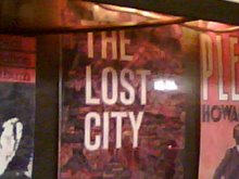
One of the old book jackets lining the walls of Chumley's. Eternal Shame on Bloomberg, the City Fathers, and the powers that be that this cultural landmark has STILL not been saved and reopened.

The late, great McHale's, the death of which inspired the birth of this blog.
The original, running Jeremiad on the vestiges of Old New York as they are steamrolled under or threatened by the currently ruthless real estate market and the City Fathers' disregard for Gotham's historical and cultural fabric. Est. January 2006.
Contact Me
Contact Me
Lost City Neighborhood Guides
Blog Archive
-
▼
2008
(881)
-
▼
February
(66)
- A Good Sign: Lee's Chinese Laundry & Cleaners
- Our Burden Grows
- A Good Sign: Michael's Meat Market
- The Shedman Cometh
- Rumblings at Chumley's
- Vegetarians, Avert Your Gaze
- Old 42nd Street Ain't Gone Yet
- What a Croc
- Beauty in a Strip Mall
- How to Give a Neighborhood the Finger
- Rat Squirrel House Still Shedless, But More Popula...
- First the Dodgers Leave, Now This
- Crowds and Lennon at Cafe La Fortuna's Last Day
- Does Chumley's Road to New Life Begin Monday?
- Can't Yoko Do Something?
- Is Monteleone Bakery Endangered Again?
- When Did That Go?
- Shining the Greasy Spoon
- Not Longer Seeing Red
- Rat-Squirrel House Hits the Tube
- It's the Little Things
- A Good Sign: Caffe Dante
- The Mysterious Masks of Tiffany Place
- Beautiful Coney Island Sign Wiped Out
- A Good Sign: Rainbow Cafe
- Landmarks Commission to Consider Whether Ugly Towe...
- Red Hooks Vendors Challenged by Cowardly Anonymous...
- Bad Days for Red Sauce Joints
- More Images of What Was Tin Pan Alley
- The Great Wall of Union Street
- Second News Cycle on Rat-Squirrel House Begins
- History in a Starbucks: 1500 Broadway
- Cemusa Hasn't Gotten This One Yet
- Where Have You Gone, George Gershwin?
- Rat-Squirrel House Lady Disappoints DOB
- A Good Sign: La-Rosa Cubana Cigars
- Flatiron in the Snow
- Some Stuff That's Interesting, and Some That's Abo...
- It's Snowing
- Stop Me Before I Predict Again!
- D-Day for Queens Landmarks
- Is This the End of Rat-Squirrel House?
- Well Said
- This One Really Is the City's Fault!
- Quote of the Day; Loss of the Day
- A Good Sign: Lafayette Grocery and Dairy
- Mob Hangout-Like Marco Polo Really Mob Hangout
- A Good Sign: Frank's Cocktail Lounge
- Five Days Left
- A Million Words—Each an Indictment of Crapitecture
- A Good Sign: French Garment Cleaners Co.
- What You'll Hear in the Bathroom at the Four Seasons
- Some Stuff That's Frustrating
- Neighborhood Roots
- My Shuttle in the Woods
- Did I Say $6,000? I Meant $43,000!
- Sorry Rev, The City Don't Care About Them Bones
- Some Stuff That's Interesting
- So That's It
- Other Super Ideas for Our City's Future Greatness!
- Why Change What's Perfect?
- Who Will Save the Signs?
- Queens Temple Goes to a Vote Feb. 12
- Dept. of City Planning Obdurate, Arrogant, Dismissive
- The Crossdresser on the Ceiling
- The Winter of Our Discontent
-
▼
February
(66)
Recently Lost Landmarks
- Stage Deli
- Prime Burger
- The Lenox Lounge
- El Faro
- Lascoff Drugs
- Colony Music
- Lafayette Pastry Shop
- Eagle Movie Theatre
- Bill's Gay 90s
- Holiday Cocktail Lounge
- Manganaro Grosseria Italiana
- Hinsch's Confectionary
- The Original Ray's Pizza
- La Petite Auberge
- Leske's Bakery
- Mars Bar
- Elaine's
- P&G Bar
- Joe's Superette
- Jeffrey's Meats
- Karl Ehmer
- Guss' Pickles (LES version)
- Shore Hotel
- Von Westernhagen Restaurant
- Fedora
- The Rum House
- Cono & Sons O'Pescatore Restaurant
- Carmine's at the Seaport
- Gino
- Empire Diner
- Cavalier Restaurant
- Diamond Dairy
- Armando Tailor
- Tavern on the Green (as it was)
- Cafe Des Artistes
- Jay Dee Bakery
- Joe Jr. Restaurant
- Joseph Patelson Music House
- Manny's
- Arnold Hatters
- Amato Opera
- Astroland
- Vesuvio Bakery (space reopened in fall 2009, largely untouched, as Birdbath Neighborhood Green Bakery)
- The "21" Club's Tie Requirement
- Richard Yee's Chinese Restaurant
- Long Island Restaurant
- Holiday Lights at Bronx Zoo
- The Green Church
- Shea Stadium
- Yankee Stadium
- Lehman Brothers
- Nikos Magazine & Smoke Shop
- Florent
- Cafe Mozart
- Le Figaro Cafe
- Montrachet
- Cheyenne Diner
- Ridgewood Theater
- Armando's
- Cafe La Fortuna
- Fazil's Times Square Studio
- Pozzo Pastry
- Frank's Restaurant
- Cedar Tavern
- Donuts Coffee Shop
- Jahn's Ice Cream Parlor
- Morrone Bakery
- Brooke Astor
- The Wall Street Journal
- Moondance Diner
- Gertel's Kosher Bakery
- Kurowycky Meats
- Little Charlie's Clam Bar
- Claremont Riding Academy
- Vinylmania
- Jade Mountain
- Gotham Book Mart
- CBGB's
- Coliseum Books
- The Continental
- The Second Avenue Deli
- McHale's
- Howard Johnson's (Times Square)
- Gage & Tollner
- Arnold Hatters
Endangered Landmarks
- 48th Street's Music Row
- Chelsea Hotel
- Chumley's
- Donovan's Pub
- Erasmus Hall (The Original)
- Katz's Deli
- Le Veau d'Or
- Max Fish
- New York Stock Exchange
- Ray's Deli
- St. Paul's Episcopal Church (Woodside)
- Streit's Matzoh Factory
- The Upper East Side Diners
Links
- Aaron Signs
- Ampersand Seven
- Architakes
- Astroland's Last Days
- Between Productions
- Bloomberg Watch
- Boogiedowner
- Bowery Boogie
- Brownstoner
- Bushwick BK
- City Room
- Cooked Books
- Curbed
- Develop—Don't Destroy Brooklyn
- Dino's Now and Then
- Eater
- Ephemeral New York
- EV Grieve
- Fading Ad Blog
- Flaming Pablum
- Flatbush Gardener
- Forgotten New York
- Gawker
- Gothamist
- Gowanus Lounge
- Greenwich Village Daily Photo
- Harlem Bespoke
- Ivy Style
- Lakemichiblog
- Los Angeles Time Machines
- Midtown Lunch
- Miss Heather
- NearSay NYC
- New York City Signs
- New York Songlines
- Only the Blog Knows Brooklyn
- Pardon Me for Asking
- Pork Chop Express
- PortSide NewYork
- Queens Crap
- Restless
- Roadside Architecture
- Scripophily New York Banking History
- Slice
- The Bowery Boys
- The Kingston Lounge
- The Real Deal
- The World According to Bitchcakes
- Vanishing NY
Lost City in the News
- AM New York
- AM New York (4/29/09)
- BestCollegesOnLine
- Brooklyn Eagle
- City Room, NYT (report on end of Lost City)
- Eater (report on end of Lost City)
- Gothamist (report on end of Lost City)
- Grub Street
- Hat Life
- Media Bistro (report on end of Lost City)
- New York Observer
- New York Post
- New York Post—Tin Pan Alley
- Not For Tourists
- The Brian Lehrer Show
- The New York Times
- The Villager
- WCBS-TV
- WFUV's "Cityscape" (March 8, 2008 edition)
About Me
- Brooks of Sheffield
- New York City, New York
- I have lived in New York City since 1988 and earn my bread as a writer. I began this blog in January 2006. Beyond that, don't be so nosy. "I am not a pessimist; to perceive evil where it exists is, in my opinion, a form of optimism." —Roberto Rossellini

One of the old book jackets lining the walls of Chumley's. Eternal Shame on Bloomberg, the City Fathers, and the powers that be that this cultural landmark has STILL not been saved and reopened.

The late, great McHale's, the death of which inspired the birth of this blog.


No comments:
Post a Comment