Storefront Architecture
Storefront architecture was simply more interesting in the past.
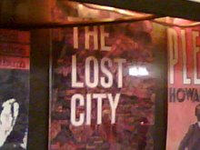
Look at this old, empty storefront in Chinatown. Doesn't look like much, huh? But get past the griminess and graffiti and rust and just take in the bones of it. The all-important, framing, store window dominates the eye, set right at the height of a passerby's gaze. It's like a jewel set in the middle of a ring. The entrance to the store was up the steps, into the vestibule and through a side door—a much more intimate, welcoming path than the kind of thing you see today: the blatant glass sliding door flush with the sidewalk. Moreover, the shop is elevated, so once you're inside, your experience with the merchant can feel move removed from the hustle and noise of the City, above the hubbub on the street. You can have a real conversation, a private transaction.
There may have once been a business down the steps, on the lower half of the building. So one could run a second errand while stopping at this address. The whole affair—stairs, railings, windows, brickface—has depth, texture, dimensions, layers. Simply put, it has individuality. So much better than the common model of today: a mammoth big box with big windows and a big neon sign on top. Plopped on the sidewalk! Don't like the way it looks? Who cares! Get in there and shop!
In fact, I would go so far as to say there is no such thing as storefront architecture in today's world. The huge brick cubes and rectangles that they stick Walgreen's and Modell's and Whole Foods and Sleepy's in could just as easily function as warehouses holding auto parts in some industrial park. There's nothing special about them that says "butcher" or "pharmacy" or "tailor." Instead, they say "empty shell that was the quickest to erect, so we can get to the business of minting money."


1 comment:
this was a video rental store called "phuket" , there used to be a very nice thai chinese woman who ran it.
Post a Comment